Summary
Expanding your product line with new packaging formats, whether for sustainability, convenience, or market reach, is a strategic move that risks confusing loyal customers if not handled correctly. The key to successful portfolio expansion is establishing non-negotiable brand elements—like color schemes, typography, and logo placement—that remain perfectly consistent across all variations. By leveraging these design anchors, new formats feel like a natural evolution of the brand, not a jarring departure, ensuring that functional innovations (such as squeezability or sustainability) support your brand story without ever diluting its hard-earned identity.
Expanding a product portfolio with new packaging formats is a strategic move for growth, but innovation requires a careful balance between novelty and consistency. While you might want to embrace sustainable packaging solutions or more accessible packaging formats to address evolving consumer preferences, you don’t want to dilute or compromise your brand identity when making changes.
Brand equity is built over time through recognizable design elements, consumer trust, and consistency in messaging, so expanding your packaging portfolio is about striking the right balance between innovative formats and brand continuity through messaging and design.
Introducing New Packaging Formats While Preserving Brand Integrity
Brands often need to introduce new packaging formats to stay competitive, meet sustainability goals, or align with consumer convenience preferences. One of the best examples of this is the embrace of flexible packaging over the last several decades as consumers have increasingly desired packaging that meets their convenience and portability needs. Brands might also consider ergonomic packaging for different use cases.
While adjusting to market demands is expected, consistent branding is necessary to maintain brand recognition. To do so, establish a set of non-negotiable brand elements (such as colors, typography, iconography, and messaging style) that must remain consistent across all packaging variations.
Brand packaging might vary, but the main point is that packaging portfolio expansion should feel like an evolution of the brand, not a departure from it.
Leveraging Design Principles to Maintain Consistency
When launching new packaging formats, consistent design elements across different formats help reinforce brand recognition and maintain consumer trust.
By carefully considering key visual components, you can ensure that new packaging integrates seamlessly with existing product lines.
Color Schemes
Color is one of the most recognizable aspects of a brand. Even as packaging formats evolve, maintaining a consistent color palette across all products helps consumers instantly associate new items with your brand.
Typography
Fonts are a subtle part of brand identity. It might not be noticeable all the time, but if it’s suddenly changed, your consumers will notice.
Consistent typography across different packaging formats contributes to a unified brand voice. Using the same font family across product lines reinforces the most important thing: familiarity.
Logo Placement and Size
What do the most famous brands have in common? A logo that is immediately recognizable. The logo not only needs to be placed in a way that doesn’t disrupt the functionality of the packaging but also needs to be proportionate across varying packaging sizes in order to prevent inconsistencies that could dilute brand perception.
Shape and Structure
While different products may require distinct packaging formats, incorporating subtle design cues can create a seamless transition between them. Signature silhouettes, embossed patterns, or unique textures can tie new packaging back to the brand’s core aesthetic.
Balancing Functionality with Visual Identity
Innovations in packaging should serve both usability and brand recognition. Consumers expect packaging to be easy to use, sustainable, and storable without losing the familiar visual elements that define a brand. Striking this balance ensures that functional improvements support, rather than disrupt, brand identity.
Sustainability Considerations
As more brands transition to eco-friendly packaging, new designs should align with your brand’s sustainability narrative rather than feel like a departure. Packaging should also prioritize recyclability to ensure that environmental responsibility is integrated without compromising recognizable design elements.
Ease of Use
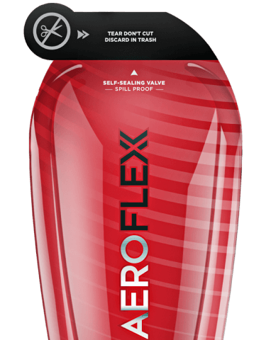
Functional innovations should improve the consumer experience while preserving brand cues. For example, squeezable packaging with self-sealing valves offers convenience without altering brand aesthetics. Whether incorporating resealable closures or ergonomic designs, changes should enhance usability without confusing loyal consumers.
Retail and E-Commerce Impact
Whether displayed in a retail aisle or featured in a digital storefront, new packaging should feel like a natural extension of the brand. Consistent branding elements, clear typography, and distinctive colors help maintain shelf presence and an appealing unboxing experience.
Expanding Possibilities with the AeroFlexx Pak
The AeroFlexx Pak is a customizable packaging solution that empowers brands to innovate without sacrificing identity. With a range of shapes, formats, and design choices, brands can tailor their packaging to enhance both functionality and aesthetics. Between spill-resistant designs, easy-to-use dispensing, and sustainable materials, the Pak helps strike the perfect balance between practicality and brand storytelling.
Want to see how liquid packaging can enhance brand creativity? Check out our infographic: 3 Ways Liquid Packaging Allows for Greater Brand Creativity.